Given Due date is 30 APRIL 2011.
I hope to be working on both parts as I have said but will work towards submission on this date.
For further reading on colour www.worgx.co.color/
To help with how colour is used, look at below photographers as they are renowned for colour
Steve McCurry - photojournalism
I found this set of images on u-tube which moved me dramatically. Thought provoking, exceptionally graphic and sad. Mind blowing that we are all very upset and angry about the small material things that happen in our lives.
To achieve such images would entail total immersion into the sadness of this world which I am sure would have a profound effect on your very existence. You must from your experience see an image from afar. What an enormous responsibility you would have not to allow your emotional and personal thoughts distract you from achieving a great image as well as covering the story effectively.
His use of colour is sublime and provocative drawing your attention to the very purpose of the portrait. I looked through some of his work and came across this one particular image that filled me with sadness at the loss of innocence and childhood, recognised and highlighted I am sure with the purposeful influence of lip and cheek colourings.

The little girl must be no more than about 4/5 but womanly attributes are attached to her via lipstick which is vivid. A sad but true consequence of the tradition and culture to which she is a part.
I have now found him on the Facebook http://www.facebook.com/attitudewithstylephotography/posts/148412238561541?ref=notif¬if_t=share_comment#!/pages/Steve-McCurry-Official-Page/97838403510
Also his blog, which I have now subscribed. I will be looking further into this as time allows. Steve McCurry Blog
Bruno Barbey
http://www.magnumphotos.com/Archive/C.aspx?VP=XSpecific_MAG.PhotographerDetail_VPage&l1=0&pid=2K7O3R13FGT6&nm=Bruno%20Barbey
Still looking at his work. His use of colour defines depth and warmth. I would imagine this comes from his Moroccan background and it’s use “captures the spirit of the nation”.
I particularly like this photograph. Though he appears to be renowned for harmonious colours and those next to each other in the colour wheel (complimentary) this particular one has added the red for contrast. I really like this composition, it tells a story of environment, the necessity for the working person to put themselves out there to survive.
Everything about it spells life.

Martin Parr - Social documentary/art photography
Martin Parr Blog
Modern life depicted in an almost picture postcard way. There is certainly an element of fun in his images. I see from reading about him that he does actually have a collection of picture postcards from the 1950's through to the 1970's.
"Juxtaposed" is a word that seems to be predominately used when people review or discuss his work. He does without doubt awaken the potential of images and contrasts that we may otherwise overlook as just a normal scene on a normal day. Depth and emotion is a crucial part of photography and colour can really relate this factor.
I have not had chance to look at the following three recommendations, but will do over the duration of this part of the course.
Ernst Hass -Nature and flora work
Charles Wait - Landscape
William Eggleston - Social documentary
Exercises
Exercise 1 Control the strength of colour
Find the average exposure settings on your camera, and a viewpoint that fills the viewfinder frame. Take a sequence of photographs all composed the same, but differently exposed from bright to dark.

I brought a roll of bright wrapping paper and stuck it up in the dining room to photograph it. Metered the light using automatic on the camera.
Set the camera on the tripod and using the average reading which was 1/5 sec at f7.1.
The slide show above is a sample of all the variations that were found through the different exposure. I have shown individually below three single examples that portray the correct exposure and the extreme bright and dark exposures.
The slide show above is a sample of all the variations that were found through the different exposure. I have shown individually below three single examples that portray the correct exposure and the extreme bright and dark exposures.
The fourth colour block in the pattern above and also shown below is f71.
f7.1

Followed by f5 which was the widest aperture on my wide angle lens.
f5

The sequence that I then took was f5.6f,6.3, f7.1,f8,f9,f10 as shown in the block above
The final exposure was f11 as shown below.
f11

From the exercise I can conclude that the smaller the aperture the more black became evident in the red and larger the aperture the more white became apparent.
This is an obvious consequence as more or less light is reaching the sensor with each change of aperture.
As the aperture decreases, along with the saturation so the apparent definition of the colour red becomes more difficult. It no longer can be described as what I would see as red as it looks dirty and unattractive, verging on a non-decrepit colour.
However, as the aperture becomes larger the attractiveness of the colour stays, but again ceases to the red that I would expect and starts to look more orange.
As the brief for the project suggests each quality that defines the colour becomes evident and shows strongly each time the aperture is changed.
Exercise 2 Primary and Secondary Colours
Find scenes or parts of scenes that are dominated by a single one of the primary or secondary colours.
YELLOW


Yellow Forsythia

f5.6 at 1/800 sec 18mm ISO 100
Forsythia a beautiful Spring shrub that signifies the start of spring. There are masses around but they only seem to be available for a short time. Handheld on my wide angle lens. DoF was set to be shallow. It was a very dull day but I think the colour came out really well.
BLUE


Blue sky at the Lake

f4.5 at 1/640 sec 70mm ISO 100
Walking through our local lake area I looked up and the sky was a brilliant bright blue and quite obviously fitted the brief perfectly. I wanted to add some interest hence the addition of the vapour trail and tree branches. 70-300 lens used.
RED


Burst of Poppies

f22 @ 1/250 200mm ISO 1600
Red had been a hard colour for me to pin down and over the months I have been trying to find a composition that I would be happy with. Finally today with the poppy explosion that has suddenly happened I have found the one.
Tripod mounted I set the ISO to auto for a reason that baffles me at this time. I think it was because I was running late for work and wanted to capture the image. This is a very real downside to part time study!
Tripod mounted I set the ISO to auto for a reason that baffles me at this time. I think it was because I was running late for work and wanted to capture the image. This is a very real downside to part time study!
However the capture is good save the noise! I used my 70-300 lens as the macro is the best of all the lens I have. It also makes it possible for to have some distance from the subject but also gain a good image.
ORANGE


Sunset on the Allotment

f4 @1/160 105mm ISO 100
A sunset down on the allotment. The yellow still left in the cloud made the orange so deep and amazing. My partner had been digging away and we had been chatting and all of a sudden a normal sunset developed into this fabulous view. I had my camera sat on tripod waiting, just in case it was a good one, but this was just amazing. I walked away satisfied with what I had but also with the feeling I could always do better.
Tripod mounted wide angle lens and a chair to sit and wait.
Tripod mounted wide angle lens and a chair to sit and wait.
VIOLET


Hand held and taken with my standard 18-55 lens. I went down our local allotment to get some photographs and found these purple Brussels sprouts. I must say I have never eaten a purple sprout but they do look very pretty and worked perfectly for this secondary colour.
I added some vibrancy and saturation in Lightroom along with some black to bring the detail out further. I am very pleased with the outcome.
GREEN


Green Moss
 |
| 1/100 sec f16 3omm ISO 800 |
Taken in a neighbours garden. The green of the moss was so striking in the frame and met the brief completely. Taken with my standard lens I had to be on tip toes to reach. The texture really emphasises the colour.
Notes after finishing the above section
Having the NEC monitor has made a great difference to how I see the photographs as it enables a really clear visual display of each colour. I am very lucky with this as it has helped enormously along with the new PC.
The CS5 and lightroom software have also been a great asset to me. I am starting to look at the world from a completely different and wonderful angle, seeing photographs in every part of my life. Disappointed if I don't have the camera with me or if I make a fluff on the setting is showing that I am taking pride in what I am doing also, more importantly trying to make it the very best that I can and always getting better.
Exercise 3 Colour Relationships
Part 1 Produce one photograph for each combination of primary and secondary colours, adjusting distance, focal length and framing to compose the picture to the following proportions.
Red:Green 1:1
 |
| 1/60 at f5.6 |
Equal proportions of red and green, taken in Worcester and was a flower seller showing his display for Valentines day. Using my wide angle lens I positioned myself at floor level and set the camera on the tripod. I cropped the photograph a little to remove the more pink looking cushion as much as I could.
Again, increased vibrancy, saturation and blacks. I love the photograph, the colour and composition work really well. I also like the droplets of water in the petals. I passed a copy of all I did to the flower seller who loved them.

Skate Park
Exercise 4 Colours into tones in black and white
Orange:Blue 1:2
 |
1/8 sec at f5.6
|
1 part orange, 2 parts blue. Handheld using wide angle lens set to macro for closeness of the subjects. A bit of a mad dash on this one it is a glazed ornamental ball I have outside my front door, combined with some crocus growing on the village green, again just outside my door.
The crocus shown on the vase were more yellow than orange when viewed on my monitor, but the reflection in the glazed ball was orange and the objects worked a treat with the slight twist on the composition.
Yellow:Violet 1:3
 |
| 1/60 sec at f10 |
I have increased the size of this image as when compressed it does look a little pink. Hence the reason why it is displayed slightly larger than the other images. The yellow is 1 to 3 times smaller than the violet.
I have used a vignette to dispose of some of the green from the frame and again my increase in vibrancy, saturation and blacks to makes the colour pop out. I considered just having the pansy in the frame alone.
I am wondering if that would be better now so here is an experiment to see if it works.

I cropped the image and increased the black slightly. I don't like it as it has lost a lot of the drama of the first image and to be honest it does not show the ratio any better for me. So I will stick with the original concept.
Part Two: Produce three or four images which feature colour combinations that appeal to you.
The morning sky image below was taken a few weeks ago as the colours in the sky outside my door one morning where amazing and absolutely appealed to me. The orange and the blue combination was dramatic and enticing. So I quickly threw some clothes on before it went away.
Sadly I had missed the very best, but I think this image is lovely anyway and did not suffer the time lapse too much. Three exposures processed as HDR through CS5 and then an increase in blacks. The reason for the HDR was not really the colour but the detail in the branches and I think that works really well.
Sadly I had missed the very best, but I think this image is lovely anyway and did not suffer the time lapse too much. Three exposures processed as HDR through CS5 and then an increase in blacks. The reason for the HDR was not really the colour but the detail in the branches and I think that works really well.
Morning Sky
 |
1/13sec at f5.6 ISO 100
Skate park had an appeal in a completely different way. The contrasting and striking colours showed the age and independence of the youngsters who go there. The impact is immediate and the content clear and concise.
|
 |
| 1/125sec at f11
I came across the branch of spring quite unexpectedly. I had gone looking for colour, foraging around the garden of a empty and for sale house in our village. The colour combination gives the very simple composition depth and purpose. It exudes life and continuation even through decay.
I like the DoF and the whole photograph. Not something I would have even looked at should I not have been doing this course. |
Branch of Spring
 |
| 1/100sec at f11 ISO800 |
Take the four filter red, yellow, green and blue, and make a still life that includes these colours.
Red & Green peppers, blue salad cutlery and a couple of yellow egg poachers.
Image 1 – Original with Grey Card

Reference shot, with grey card
Image 2 – Original No Card

Reference shot with no card
Image 3 - No filter and default

Every colour is flat and each of them have the same presence in the frame. The tones in the yellow and blue are light and the green and red are a little darker.
Image 4 – Yellow Filter

Image 5 – Red Filter

The red filter has quite an effect on tones. The yellow and the red become significantly lighter and the green and blue become darker.
Image 6 – Blue Filter

The blue filter is very dramatic indeed. The yellow and the red could easily be lost in the background. The blue has become virtually transparent and the green is dark but given great emphasis. I am not sure that the blue I used was really the best choice for this.
Image 7 – Green Filter

The green filter has made the blue very light, but emphases the yellow. The red is suppressed and the green is emphasised.
It is my intention to put some filters into operation on some of my images to see how it actually affects a composition. It seemed to me that using a filter is a way of bringing out certain parts of the image and suppressing others and it will be interesting to put this into a composition. I especially like the idea in a landscape situation.
Assignment 3 Colour
Inspiration and prior ideas and suggestions
National Geographic
An excellent suggestion by Andrea. I had found some colour wheel information while reading this section, prior to starting but this is a lot better.
http://www.worqx.com/color/
I have put the colour wheel information from the site here so i can refer back when I upload images for the assignment.
An excellent suggestion by Andrea. I had found some colour wheel information while reading this section, prior to starting but this is a lot better.
http://www.worqx.com/color/
I have put the colour wheel information from the site here so i can refer back when I upload images for the assignment.
Colour Wheel

A colour wheel (also referred to as a colour circle) is a visual representation
of colours arranged according to their chromatic relationship.
of colours arranged according to their chromatic relationship.
Begin a colour wheel by positioning primary hues equidistant from one another,
then create a bridge between primaries using secondary and tertiary colours.
then create a bridge between primaries using secondary and tertiary colours.
These terms refer to colour groups or types:
 Primary Colours: Colours at their basic essence; those colours
that cannot be created by mixing others.
 Secondary Colours: Those colours achieved by a mixture of
 two primaries.
 Tertiary Colours: Those colours achieved by a mixture of
 primary and secondary hues.
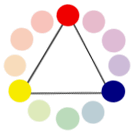
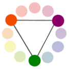
 Complementary Colours: Those colours located opposite
 each other on a colour wheel.
 Analogous Colours: Those colours located close together on a
 colour wheel.
The colour wheel can be divided into ranges that are visually active or passive. Active colours will appear to advance when placed against passive hues. Passive colours appear to recede when positioned against active hues.
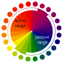
- Advancing hues are most often thought to have less visual weight than the receding hues.
- Most often warm, saturated, light value hues are "active" and visually advance.
- Cool, low saturated, dark value hues are "passive" and visually recede.
- Tints or hues with a low saturation appear lighter than shades or highly saturated colours.
- Some colours remain visually neutral or indifferent.
Assignment images
1. Complimentary Colours
Two colours that face each other on the colour wheel.
Two colours that face each other on the colour wheel.
Complimentary 1
Red & Green Roses

f9 @ 1/5sec 55mm ISO 800
Taken with my 50mm Prime lens. The flowers were in a vase, direct sunlight indoors by a window. I wanted to have the sun outline on the edge of the flowers to given them an additional dimension.
By far the largest impact of this photograph is the red rose itself. The shaft of light coming down keeps your eye on the rose but the stems and flashes of green at the top gives them substance and meaning.
By far the largest impact of this photograph is the red rose itself. The shaft of light coming down keeps your eye on the rose but the stems and flashes of green at the top gives them substance and meaning.
Balance & Movement

The balance is perfect to show the flower but does not detract from the very thing that gives it life – the stem.
There are many points that work with this photograph like the edge of the flowers glinting how I wanted them too, with the shaft of light streaming on them. The DoF works as the stems and leaf edges are nicely in focus.
The one thing I would change is the ISO it is far too high and has had an impact on the ability to improve the colour depth. It is a shame but I have kept the image as it shows and highlights things I can improve and understand better in the future.
Complimentary 2
Blue & Orange Eastbourne Beach & Pier

f25 @1/60sec 16mm ISO 400
Taken on a chilly but bright morning in Eastbourne. Handheld wide-angle lens. I took the photograph on a very light exposure so I could emphasis the pier legs and building details by increasing the blacks and contrast in Lightroom. I have increased the saturation so the colours of both the sky and the beach are more prominent.
My composition achieves the sweep of the beach and the huge influence of the pier itself. This is one of my favourite photographs and I am happy with the way it came out. I had done much forward thinking on the exposure and composition prior to the taking and I think this has worked superbly well.
My composition achieves the sweep of the beach and the huge influence of the pier itself. This is one of my favourite photographs and I am happy with the way it came out. I had done much forward thinking on the exposure and composition prior to the taking and I think this has worked superbly well.
Balance & Movement

The balance of the colours is spectacular. The orange and the blue are both leading with the eye directly focused on the pier. The colours hold the image together with each one identifying the content fabulously.
Complimentary 3
Long Mynd Sunrise Orange & Blue

F5.6 @1/250 sec ISO 100
The two natural complimentary colours work together brilliantly. The combination is pleasing on the eye and makes you feel comfortable and safe.
A picture postcard view that is so uniquely English and gives you a feeling of stability which, reminds me of home and security.
I realise that the similar colour combination is the same as the above Eastbourne pier but feel that the two subjects are far enough apart in content value to make them both viable options. For some reason the metadata for the focal length did not record giving me information of 7.6mm
Balance & Movement

Complimentary 4
Yellow & Green Malvern Garden

f20 @ 1/10 sec 18mm ISO 200
Taken on a lovely Spring day in a friends garden. Handheld wide angle lens. I took three exposures and combined them in Photoshop. I did not use the HDR program but did increase the vibrancy and clarity in Lightroom.
Balance & Movement

I love how the photograph flows, the division of the colours works exceptionally well to illustrate a typical country garden in the Spring. The formation and regimentation that my friend has applied in his garden is well emphasised here.
2. Similar Colours
Those near each other, as in the cool and warm range of colours
Similar 1
Blue & Green Blue Bell Woods
 f22 @ 1/3sec 18mm ISO 100
I have been playing around with bluebells for the last week trying to get a similar colour composition.
The photograph was purposely taken on a very sunny day as I was hoping to get some rays shining through, but the position of the bells I wanted and the fullness of the trees prevented the rays. Nevertheless, I achieved my aim and created a nice photograph at the end.
Balance & Movement
Balance & Movement

The flow of the photograph shows the randomisation of the flowers against the grass. The barrow adds another dimension to the composition breaking up the structure. It is natural and beautiful just as nature intended.
Similar 2
Green & Yellow Car Wash 

f5.6 1/50 sec 18mm ISO 100
Similar 3
f32 @ 1/8sec 70mm ISO 200
The two images above illustrate the similar colours of yellow and green in two totally different ways.
Morrison's Car wash - Having done a little research on Morrison's the store and the colours that they use in their branding I discovered the following
Handheld wide angle lens, slow shutter speed to blur the traffic
Balance & Movement
- Yellow symbolizes positivity and buoyancy
- Green signifies tranquillity, nature, health, and freshness.
Handheld wide angle lens, slow shutter speed to blur the traffic
Balance & Movement

The balance is functional and operational, depicting the actual usage of the object.
English Landscape - A natural appearance that is pleasing to the eye for the exact same reasons that Morrison's use the same similar colour combinations.
Calming and assuring the composition is totally British.
English Landscape - A natural appearance that is pleasing to the eye for the exact same reasons that Morrison's use the same similar colour combinations.
Calming and assuring the composition is totally British.
Balance & Movement

Swathes of crops and field, a beautiful and lovely sight in the English countryside. Not quite in maximum bloom the crop shows the reasoning behind the existence of the property that stands above.
Similar 4
Similar Orange & Red along with Green and Blue Business Building

f25 @ 1/30 sec 12mm ISO 400
A few times I have driven past this block of buildings and thought the colours were so vibrant and attractive. These are some offices that surround the new hospital in Worcester.
Using my wide-angle I stooped to gain the best advantage for my composition. Increased the vibrancy that I had taken in vivid to begin with and introduced some more blacks.
Using my wide-angle I stooped to gain the best advantage for my composition. Increased the vibrancy that I had taken in vivid to begin with and introduced some more blacks.
Balance & Movement

The flow of colours functional and business like with a place for everything that flow smoothly and naturally. Ergonomically well thought out.
3. Contrasting Colours
Colours spaced about half way round the circle.
Contrasting 1
Orange & Purple Contrast - Sunset in the Woods

f5.6 1/250 sec 18mm ISO 200
I adored this view as soon as I saw it. The contrast to the eye was not as magnificent until it was framed in the camera with the exposure set quite dark.
I could not quite believe how much of a difference the exposure setting created. Both the shot and I benefited by having gone through at section 4 light, without which this photograph may never have existed.
The fast shutter speed and dark exposure totally emphases the range and the purple glow in the water. I have sharped the image to create the texture in the branches to give further impact.
Balance & Movement

A sight that is awesome and serene when caught in a frame. The shadows and darkness draws you down the smaller area and the meaning of the shot.
Contrasting 2
Blue & Red Contrasting – Shattered Dreams

f5.6 at 1.40 sec 18mm ISO 400
Blue and red is a lovely combination that adds real impact to an otherwise dull shot.
This photograph was taken on a very cold day with the sun shining blue on the window pane and through the other windows on the opposite side of the building.
The low winter sun was shining through the window to create the warm contrast in the building. I had to increase the saturation along with the blacks to emphasise the effect to this degree but the manipulation was not heavy.
The increase in the saturation and contrast also helped to really bring out the orange in the rust complementing the image further.
The increase in the saturation and contrast also helped to really bring out the orange in the rust complementing the image further.
I felt this was a great combination that worked really well and created a very powerful image.
Balance & Movement

Cold and warmth shown superbly well in one composition. The flow is equal and hard-hitting.
Contrasting 3
Orange, blue and green contrasting swan

f/25 at 1/20 sec 16mm ISO 100
On a lovely and warm day my partner and I took a ride out in the car on a specific mission to find colours. As we sat by the River Severn the swans, ducks and other wildlife paddling around came to have some bread, that we didn't have! Using my wide angle I stooped down to as low as I dare go without invading the swans space.
I thought the Lilly pads, swans beak and the colour of the soil and water made a terrific contrast to create a wonderful composition of depth. I used a dark exposure and increased the blacks and vibrancy in Lightroom.
I thought the Lilly pads, swans beak and the colour of the soil and water made a terrific contrast to create a wonderful composition of depth. I used a dark exposure and increased the blacks and vibrancy in Lightroom.
Balance & Movement

The striking colours in this composition really keep your eye busy and interested. There are quite a few elements to the photograph and even though they are contrasting they work really well for the impact.
Contrasting Purple & Green Sprouts in the Allotment

f7.1 @ 1/100 sec 35mm ISO 800
Balance & Movement

Emphasis on the purple sprouting with a shallow DoF on the green sprouts. Majestic and fabulous the purple sprouts shows off the rest of the crop.
4. Colour Accent
One small area that sits along a larger background
One small area that sits along a larger background
Similar Accent
Accent 1
Yellow with an orange accent – A variety of daffodil

f6.3 at 1/250 sec 210mm ISO 200
I went to lunch with a friend who has a spectacular garden with a view of the Malvern Hills.
This is a type of daffodil which has seen better days that from it’s former glory has revealed a nice little accent for me to portray.
I used my 70-300mm lens as the macro is superb on it. I think I would have used a little more DoF had I taken the photograph again as some of the outer detail has been lost.
The image did not require a great deal of post processing as the colours had been captured very well by my settings, but I did increase the vibrancy, contrast and blacks so it popped a little more.
Balance & Movement

Speaks of beauty and life, which is followed by regeneration with the end of the flowers beauty. A peak inside the flower was a subtle dropping of the petals.
Similar Accent.
Accent 2
Similar Colours Purple and Blue with an accent of Complimentary Red

f4 @1/125 sec 90mm ISO100
Taken at a local vintage shop in Birmingham that I go to quite regularly. Its a great place to people watch and the colour combinations are always quite striking as everyone want to stand out from the crowd. Taken with my long lens tripod mounted.
Balance & Movement

The red totally smacks you after the safety of the similar colours. A real contrast that shows the purchase of the item.
Contrasting Accent
Blue with a Red accent –Ruby with her bottle

f2.8 @1/180 sec
A friends daughter who is just using the scooter to hold onto as she takes a well earned sip from her juice. I have cropped the image to emphasis the blue and accent of red as she has some distracting pink trainers on.
This was taken on my compact camera as the weather on the day was a little poor with a chance of rain and I did not want to get caught out in a downpour with my camera.
I took the shot above so as not to distract her and keep it as natural as possible. I like the reflections in the scooter, especially Ruby’s little pony tail.
I took the shot above so as not to distract her and keep it as natural as possible. I like the reflections in the scooter, especially Ruby’s little pony tail.
Balance & Movement

Shows the importance of the cup and the ability to find it should it be lost or put down. The rest of the image is functional and none extraordinary.
Contrasting Accent
Accent 4
Contrasting Green with an Accent of Purple

f11 @ 1/80 sec 300mm @ ISO 1600
I love this shot as soon I saw it in the frame. I tried a good few compositions but liked this one the best. Purposely leaving some of the allium out of the frame I thought it lead nicely to the poppy pod. I have used a shallow DoF on my tripod mounted zoom lens. As I have said before it has a really great macro setting.
I have been taking the camera off automatic focus for a little while now to acquire a real sense of what I am trying to achieve DoF wise. I only do it when I have time and don't feel rushed. This is one of those occasions.
I focused the camera on the allium and then moved it within the frame to make the capture.
Without doubt the allium does not have the depth I would have liked and the focus does not work as well as it could but I am looking at how I could improve this.
Without doubt the allium does not have the depth I would have liked and the focus does not work as well as it could but I am looking at how I could improve this.
Balance & Movement

The green is obviously the demanding and overriding colour but as the purple and green are contrasting colours in the circle they bounce of each other quite dramatically to create a striking visual image making the allium the focus.
Conclusion
Though it is always in mind to submit my work on time it has not yet to this date been possible. Working and home study is a discipline that though I have determination to stick to, the array of wonderful and interesting photographers out there just pulls me off track sometimes. Also the interest I have in event and band photography takes a lot of my weekend up. The more I improve though the quicker and less editing I find I am doing, I hope my handing in dates will improve over time.
Balance and movement. I know that my drawing are rather crude but they show the understanding I have of the way the colour works and how each different part is balanced across the whole composition.
The whole colour part of the course has been most interesting. I have taken it to the extreme on some occasions and looked back thinking that my approach was simply too crude. Of course the whole experience has been another part of my learning process and I know that I will take this part forward as another notch to create a great image in the future. Here is to that great image and the joy of it's creation!
Part 3 Tutor Feedback
Complimentary
1
Part 3 Tutor Feedback
Many
thanks for the third assignment. You are
showing good progress on the course. You
do get two years to complete the course so please do not worry that the first
year is nearly up. You are now over
halfway and showing a real development in your photography.
Overall
Comments
You have
produced a strong set of images that clearly answers the
assignment brief. You have shown detailed research into colour theory
at the start of the section on your learning log and this has informed your work.
assignment brief. You have shown detailed research into colour theory
at the start of the section on your learning log and this has informed your work.
In your own
images you have shown a clear strength for images of plants.
Your framing, composition and technical control of exposure have all also
shown improvement. You hare writing about your images with
confidence. However do consider adding to have you can improve your
images. It is this review and reflection that ultimately allows you to
improve your photography even further.
Feedback on assignment
Complimentary
1
In this image you have
taken a familiar subject of red roses with green foliage. However by using the prime lens you have
considered your composition. In addition
the square crop has also changed the image by allowing the roses to form a
diagonal lines across the frame.
The
sunlight has added an edge to the petals that makes them look unreal. I agree with your comment regarding the ISO
but the key is that you have recognized this and is a factor that you
will look
at before taking future images.
2
This image has been well
considered to balance the blue and orange.
The
boost of the
boost of the
saturation has boosted the colours but do try to avoid
making images look
overly manipulated.
overly manipulated.
The composition has been considered so that you were standing in the
right
place to place the pier. I do also like how the groynes from the right create another diagonal across the frame.
place to place the pier. I do also like how the groynes from the right create another diagonal across the frame.
3
This is well-captured
sunset image. You have considered the
placement of the horizon by using
the rule of thirds. In addition the clouds in the sky add good
interest.
4
A naturalistic scene where
you have used the brightness of the daffodils to balance the green. I would consider shooting from a lower angle
to add a different viewpoint. In
addition the daffodils feel awkwardly cropped at the bottom of the frame
whereas I feel you could more comfortably
loose some of the trees at the top of
the frame.
Similar
1
In this image the
bluebells actually do seem to stand out from the green
(I know they are next to each other on the colour wheel.) The sunlight has added interesting patches of light in the woodland and you have seemed to
keep the exposure even. The image does look manipulated although you do
not note this in your log. The diagonal framing I think is not needed with the
(I know they are next to each other on the colour wheel.) The sunlight has added interesting patches of light in the woodland and you have seemed to
keep the exposure even. The image does look manipulated although you do
not note this in your log. The diagonal framing I think is not needed with the
striking nature of the image.
2
In this image you have
used the car wash brush. I would focus
in even closer
on the texture of the brush to create an abstract image
on the texture of the brush to create an abstract image
3
The countryside image has
potential with the swathes of the fields of rapeseed. The image on the blog does look flat in tone
and not the vibrant yellow I would expect from the scene. The composition needs some consideration, as
the tree on the right seems to be placed awkwardly at the edge of the frame.
4
In this image the colours
seem to clash – I think this is due to the mix of orange/red with the
blue/green. You could again here take
the approach to produce a more abstract image and concentrate on a detail. This would simplify the scene.
Contrasting
1
A very strong image where
you have captured the ambient light at the scene. This image shows
an advanced understanding on
how to use the exposure settings on your camera. You have followed those projects well! The image is well composed as the tree
branches form an arch
over the pool of water.
Well done on an accomplished image.
2
A well-spotted scene. You have used the broken window to form a
frame within a frame. The manipulation
does boost the colours but be careful not to do too much. It is normally good practice to do a version
with less manipulation at the same time – when you come back and view you will
probably prefer the subtler version! The
focus is not quite sharp on the window.
A larger depth of field would help to improve this.
3
In this image you have
captured the swan at the edge of the water.
The lily pads add to the scene and give interest and colour in the
water. The square
crop helps to centre the swan in the frame and to emphasize the diagonal lines of the image.
crop helps to centre the swan in the frame and to emphasize the diagonal lines of the image.
4
A very strong image and I
can see why you are proud of it. The
focus drops out at the line of the green, which creates a good division between
the green and purple. The diagonal slant
allows
the bottom leave of the sprouts to fall across the frame.
Colour accent
1
Another strong image. The small depth of field does set off the
flower well.
The bottom petal is clipped at the edge of the frame and because of this I
would crop in tighter around the top as well it becomes more deliberate that you have not included the whole of the flower.
The bottom petal is clipped at the edge of the frame and because of this I
would crop in tighter around the top as well it becomes more deliberate that you have not included the whole of the flower.
2
In this image the red bag
does stand out. I feel a stronger image
would be if
we could see the person. You could alternatively try cropping in even tighter
just around the hand and bag.
we could see the person. You could alternatively try cropping in even tighter
just around the hand and bag.
3
A good image recognizing
an opportunity. The use of the compact
has probably allowed you to take a more natural image, as they are normally
quicker and easier to use. The high
angle view allows for the seat of the scooter to be shown and to put her into
the context of the road. The red bottle
does work
well as a colour accent.
well as a colour accent.
4
In this image I find the
yellow just too subtle to work as a colour accent. The image does seem
flat due to the dull
light conditions. For final assessment
I would remove this image and use the image below instead.
5
This is another strong
image. You have shown consistently
through this assignment strength for photographing plants. The purple is a subtler accent
but does distinctly stand out from the green. The framing is tight and this
draws the eye into the structure of the allium.
but does distinctly stand out from the green. The framing is tight and this
draws the eye into the structure of the allium.
Learning logs/blogs/critical essays
This
is detailed and you are explaining your work clearly. You have taken up
the research suggestions given and provided good links to them. You may now start to link specific images by photographers to your own work – it doesn’t
have to be copying. Maybe you have been inspired by a technical aspect or an image has sparked an idea. Whatever the link – make the link visible in your blog.
My notes & feedback
Suggested reading/viewing
For
images of plants – Ernst Haas
Other
Assignment 4
Applying Lighting Techniques
Your next assignment is on lighting
techniques. This is an assignment that
can challenge many students. The key
is to consider carefully your choice of object to photograph. To help you with the assignment look at a
range of still-life photography. It is
not so easy to recommend photographers to look at, however you can look at a
variety of images in magazines and brochures.
You should note how different types of lighting could change the mood of
the image and the appearance of the subject.
In addition, don’t just stick to the
obvious viewpoints – think creatively how you can photograph the object – front
on, side on, looking up, looking down, looking inside, looking across in fact
any which way! Seriously don’t just
stick with the obvious and take time to play around with a variety of lighting.
For photographers who use natural
lighting you can look at the still-life work of Edward Weston.
Landscape photographer David Ward is
renowned for his use of natural light when shooting close up details on
location.
There are many video tutorials on the
web, which provide good techniques on lighting.
This link provides a useful
demonstration on using a reflector:
For a good series of video tutorials on
lighting the following site is useful
then go to the video library
section. The early videos – episodes 1-6
are particularly useful for some DIY equipment tips.
Another very useful site for video
tutorials is:
For details on using off-camera flash
the following website is useful:
There is also an American commercial
photographer who posts useful videos on his blog with regard to the use of
studio lighting – this may suit your style of photography:
Consider how the light can change
dramatically during the day – from early morning to the midday sun to the
evening sun. The colour of the light and
intensity will change dramatically. This
assignment does not require any lighting equipment. You can soften light by using reflectors – a
piece of white card and piece of card covered in foil will achieve good results. You can also diffuse light by shooting
through a window, which you cover with a thin fabric or greaseproof type
paper.
It is worth taking the time with the
assignment to be as creative and experimental as you can!
The links below are all good examples
for the OCA group on Flickr and show very inventive choice of both lighting and
subject!
No comments:
Post a Comment